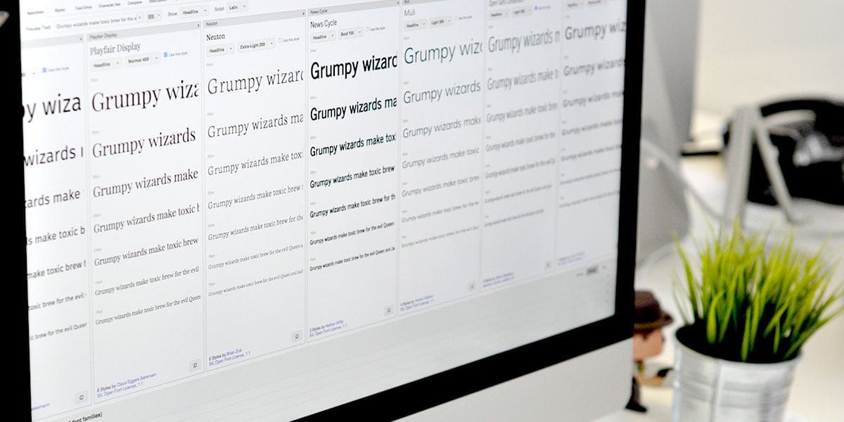
Before services like Google Fonts, Typekit, etc designers were restricted to web safe fonts such as Arial, Georgia, Lucida Grande, etc; all great fonts but with such a small pool of typefaces to choose from it didn’t allow for a lot of variety.
However, despite the huge variety now available some fonts on Google Fonts, in recent times have become somewhat ‘overused’.
Partly due to the nature of the service, being free, millions of websites take advantage of being able to use this selection of fonts so it’s no surprise that some feature more heavily on sites than others. You’ll be hard pushed to browse the web for long without coming across the likes of Open Sans, Lato, Roboto, Oswald, Source Sans and Montserrat on multiple sites.
Once again, these are all great fonts and while there’s nothing wrong with continuing to use them in your designs, why not consider some of the following lesser used fonts available through Google?
At the time of writing, Open Sans had almost 18 billion views in the last week! Almost double the second most popular font, Roboto which had a mere 9 billions views.
Karla
Currently my favourite ‘underused’ font available through Google; a simple sans-serif that offers a good, free alternative to similar premium fonts such as Neuzeit Grotesk and Maison Neue.

Playfair Display
Some may consider this one borderline ‘overused’ and with its use on site’s such as the new Tens website by Elegant Seagulls, its popularity will only increase. It’s certainly my personal favourite serif currently available on Google.

Raleway
Another one that is used quite a bit already but certainly not as much as the others mentioned earlier, Raleway is a san-serif with some unique features that makes it great for headlines. It’s also very versatile with many weights available, although unfortunately none with italic.

Open Sans Condensed
Used much less than its close cousin Open Sans, the condensed version is in my opinion one of the most underused fonts on Google. Maybe this is due to its strange array of weights/styles available but the bold version works well as all caps.

News Cycle
Another font that, arguably works better as all caps, it works great for headings.

Neuton
A simple serif with a variety of weights, works great for body copy at small sizes.

Muli
A sans-serif that I’ve only recently discovered myself only let down by the disappointing amount of styles/weights available (no bold version) but still potentially a good alternative in some circumstances to Open Sans and Lato. Note: More weights/styles are available if self hosting.

Varela Round
Again the lack of weights/styles restricts the use of this font but it still looks great on headlines and used in buttons, etc. Also its soft edge make it more suitable to projects with an element of fun i.e. child orientated.

Abril Fatface
A growing trend in web typography in 2015 is the use of strong serifs with a wide contrast in weight. Lust, which is available through Typekit, is a font that’s popularity has soared during the calendar year. Maybe with not quite as much personality as Lust, Abril Fatface is a great free alternative.

Fira Sans
Fira Sans is actually Mozilla’s own font, much like Roboto is Google’s but it is still open source and available through Google Fonts. A wide variety of weights/styles make it a very versatile sans-serif.

No doubt the popularity of these fonts will grow over time also, but the message of this post is there are some great fonts hidden below the first 10 of Google Fonts’ Popular Page. Sometimes it can be too easy (lazy!) to use the same fonts we know work well.
If you like other fonts available through Google that haven’t been mentioned in this post feel free to get in touch via Twitter and let me know!
