Good food.
A message worth sharing.
Creative design and marketing collateral that help UK Harvest share its work clearly and with care.
A practical mission.
A clear message.
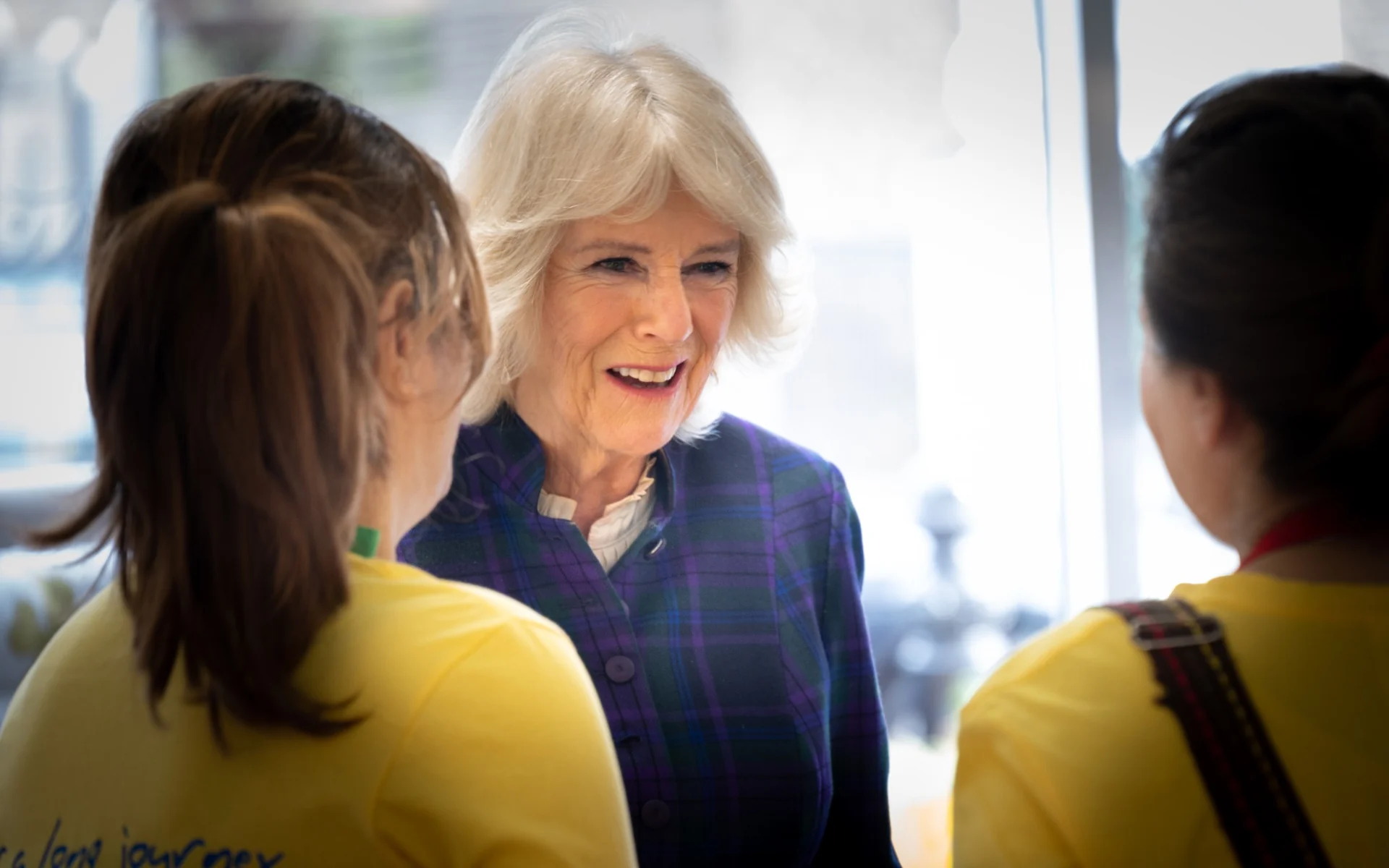
UK Harvest is a food rescue and education charity working to reduce food waste and food insecurity. It connects surplus food with people and communities who can use it, alongside education that helps people make more of the food they have. There is a lot of practical work behind that simple idea.
Our role covers creative design and marketing collateral, including posters and signage. We help turn the charity’s messages into clear, useful materials, giving its work a considered presentation and helping people understand what is being communicated and why it matters.
The brief.
The work.
The thinking.
Creative design
A charity’s communications need to earn attention and make good use of it. We design with the message in mind, giving key information space and a clear order. The creative should help people understand UK Harvest’s work, with a tone that feels welcoming and appropriate to the subject.
Marketing collateral
We create supporting materials that give the charity a practical way to share its messages. From the overall layout to the smaller details, the aim is to make information easy to take in and useful to the person reading it. Each piece is designed to feel part of UK Harvest’s wider communications.
Posters & environmental signage
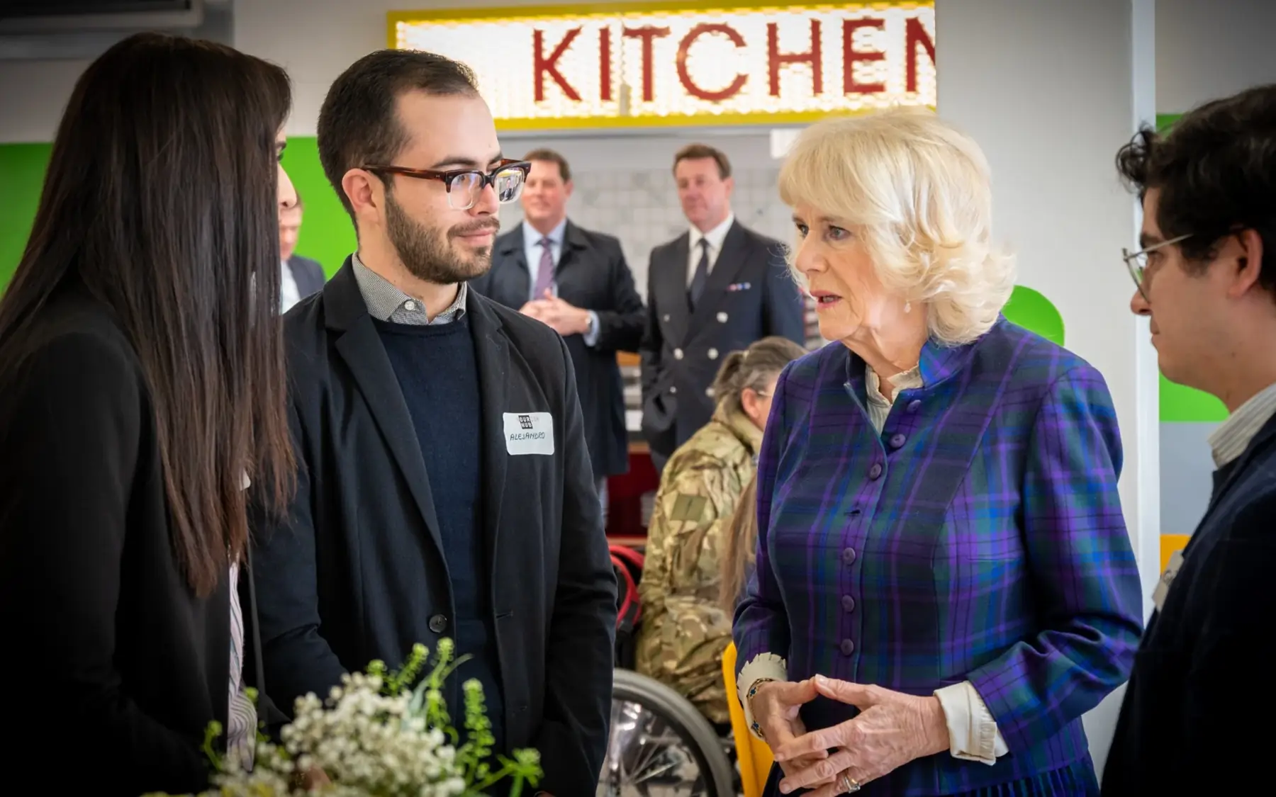
We take UK Harvest’s message into the spaces where people meet, eat and connect. From posters promoting what’s on to signage that helps people find their way, each piece needs to work at a glance. Clear messages, considered layouts and a welcoming tone make the charity’s spaces feel like part of the same story.
Thoughtful design.
Useful in practice.
The starting point is what each piece needs to do. Who will read it? What do they need to know? What should stay with them afterwards? Answering those questions helps us make decisions about the hierarchy, wording and visual presentation.
We keep the design focused on the content rather than asking the reader to work around it. A clear headline, an accessible layout and the right emphasis can make a meaningful difference to how easily a message is understood.
Made for
the community.
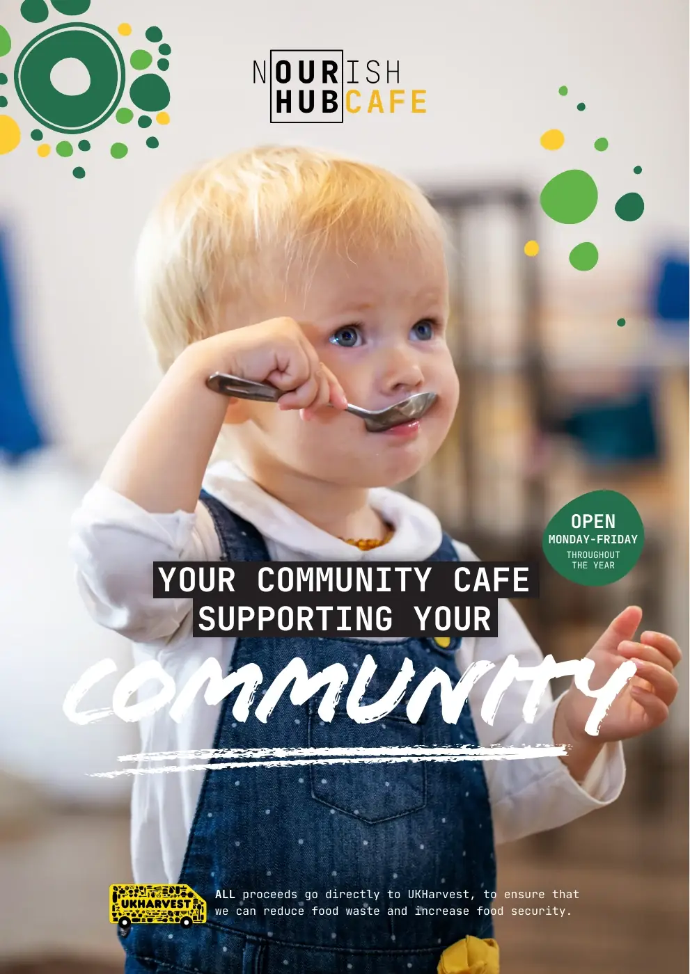
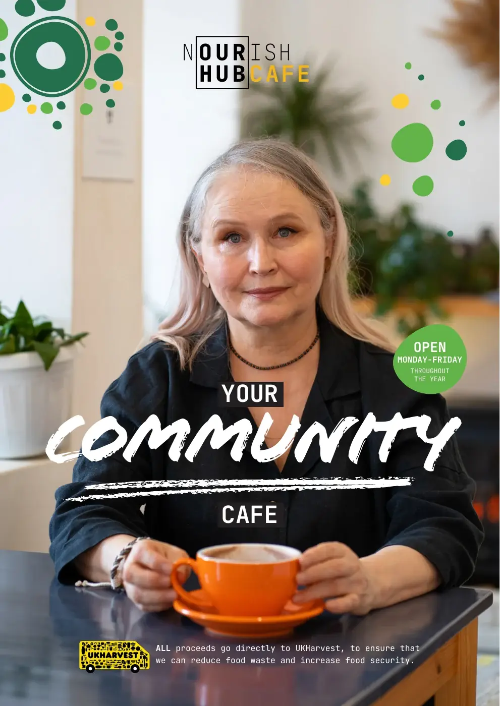
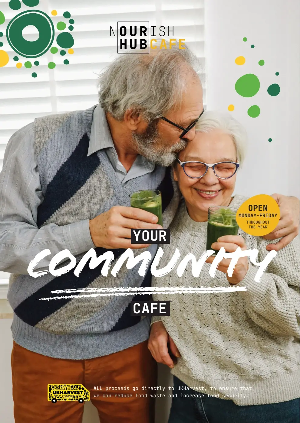
A series of A3 posters for UK Harvest’s Nourish Hub Cafe, bringing its community message to life through warm photography and a distinctive, welcoming design.
Clearly presented.
Our contribution gives UK Harvest creative materials that support the way it communicates. Consistent design helps the charity present its work with confidence, while clear information makes each piece easier to use and share.
The impact of the charity’s work belongs to its team, volunteers and community partners. Our job is to help tell that story well, with considered creative that gives the message the attention it deserves.
Your next
chapter?
Perhaps you’ve got a similar challenge. Perhaps you’re thinking, “We could do with a bit of that.” Either way, we’d like to hear about it.
Tell us what you’re thinkingA conversation is a good place to start.